One console, two very different jobs. Designing the EMTDesk admin and employee dashboards.
EMTDesk is EaseMyTrip's corporate travel platform — the B2B side of the business, where a client company's travel desk manages policy, employees, approvals and spend while its people book their own trips. The dashboard is the first screen both of them land on, and it has to serve a travel manager auditing ₹44.1L of spend and an employee checking whether their Kolkata flight got approved.
- PRODUCT
- EMTDesk Console
- Corporate travel & expense, India
- MY ROLE
- Product Designer
- Research with PM, IA, UI, handoff
- ROLES SERVED
- Admin · Employee
- Travel manager, central booker, traveller
- CONFIGURATIONS
- With / Without Create Trip
- Per-company module switch
What EMTDesk is.
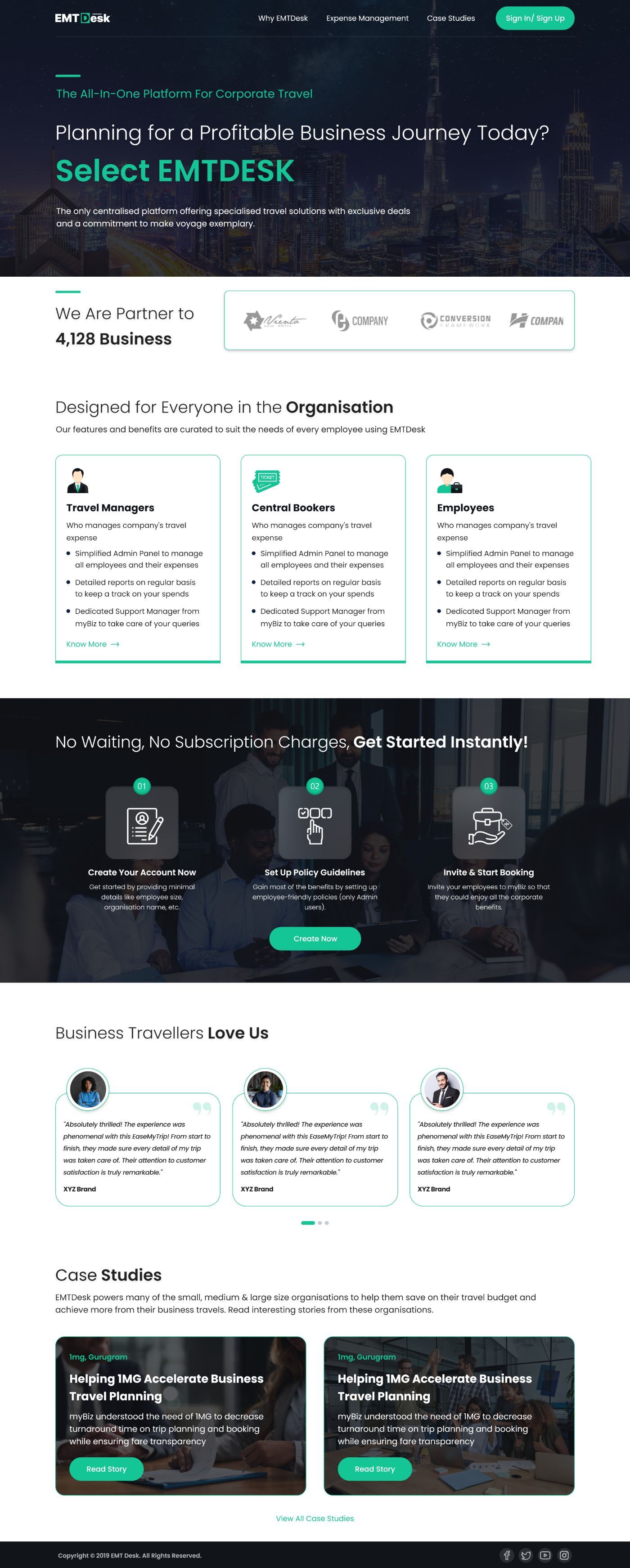
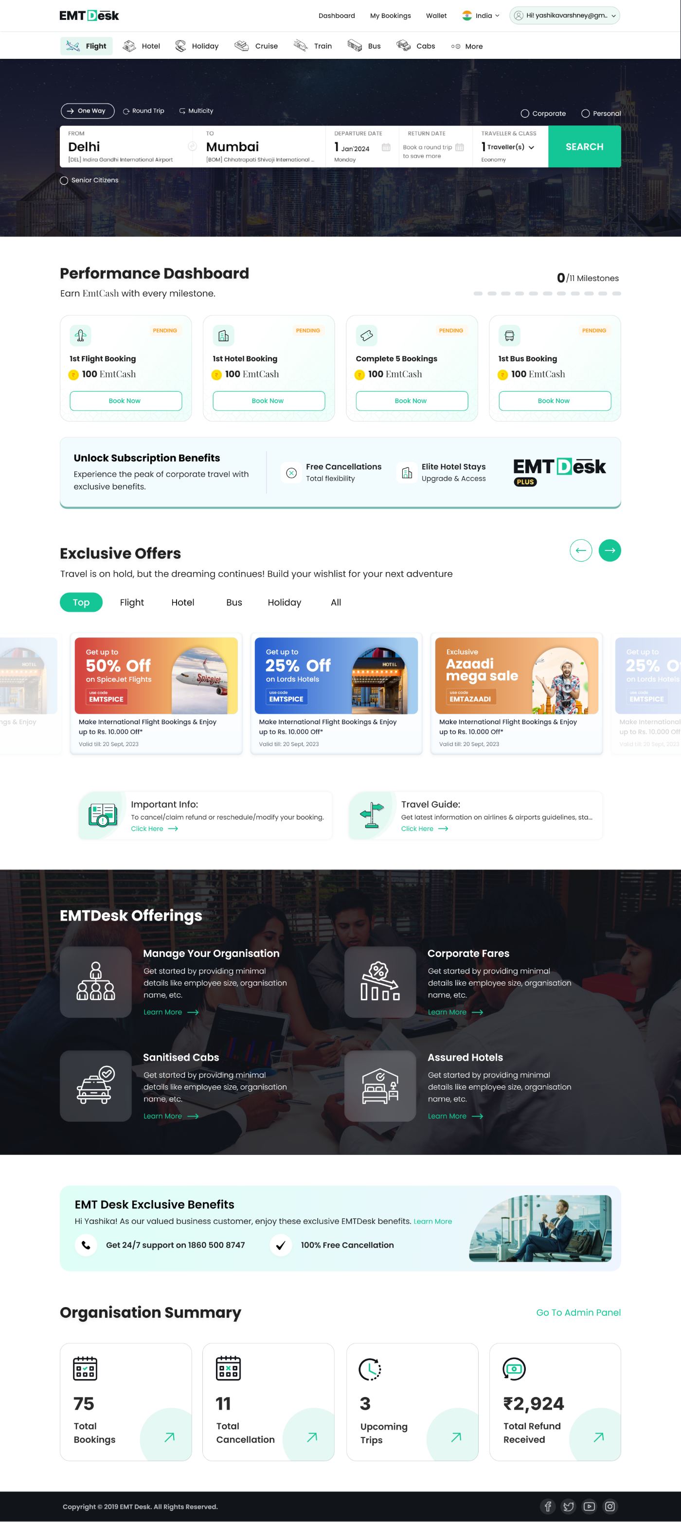
A company signs up from the EMTDesk site, sets up its organisation, invites employees, and from that point everything happens inside the console. The dashboard is the hinge between the two halves of the product: booking on one side, governance on the other.
- 01Sign up
A company registers from the EMTDesk site — organisation name, size, GSTINs.
- 02Configure
Admin sets attributes, policies, entities and which modules are live.
- 03Invite
Employees and guests are added, individually or by bulk upload.
- 04Operate
Everyone lands on the dashboard — book, approve, monitor, report.
One dashboard, every kind of client.
Corporate clients arrive with wildly different setups — some have a dedicated travel desk and strict policy, some let employees book directly, some buy the platform but never switch on trip creation. One rigid dashboard could not cover that spread, and building a separate screen per client was not maintainable.
“How does one dashboard hold both an admin's governance view and an employee's own-travel view, and still adapt to whichever modules a client has actually bought?”
Admin vs. employee.
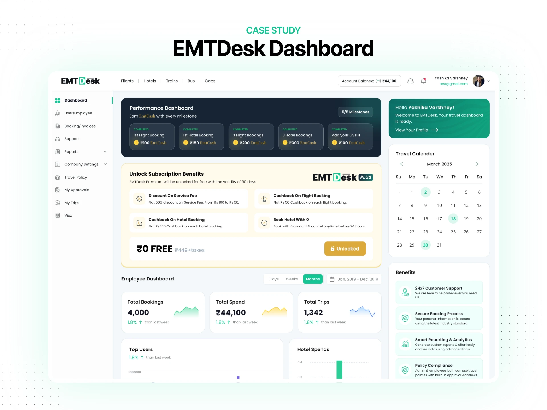
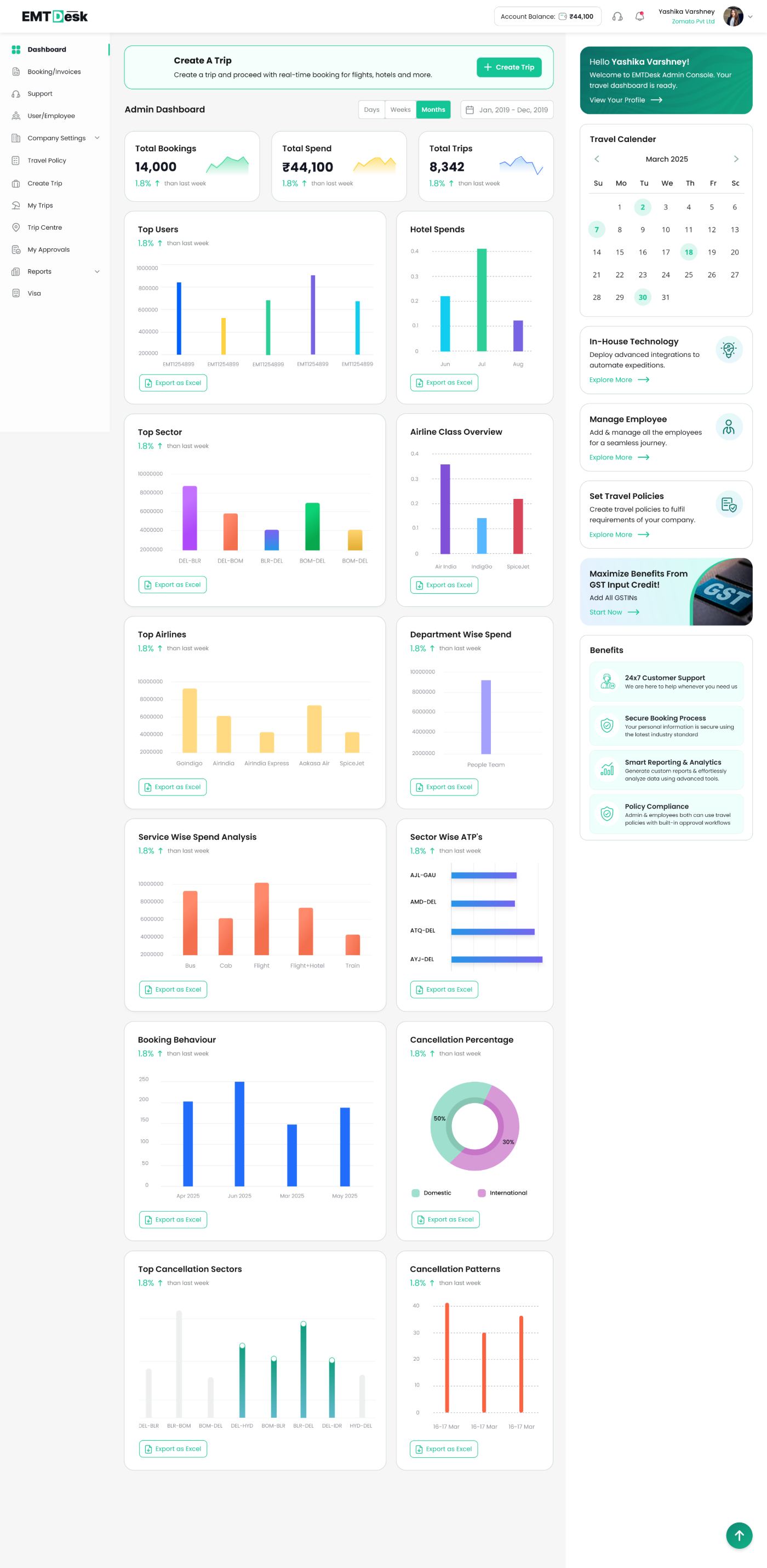
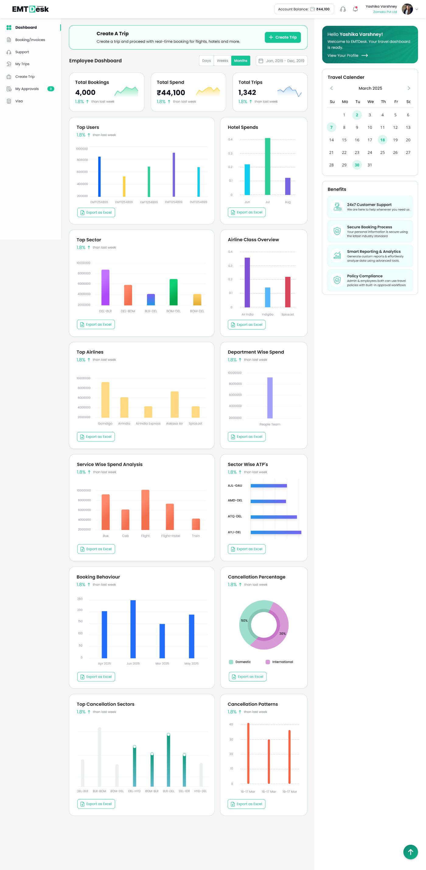
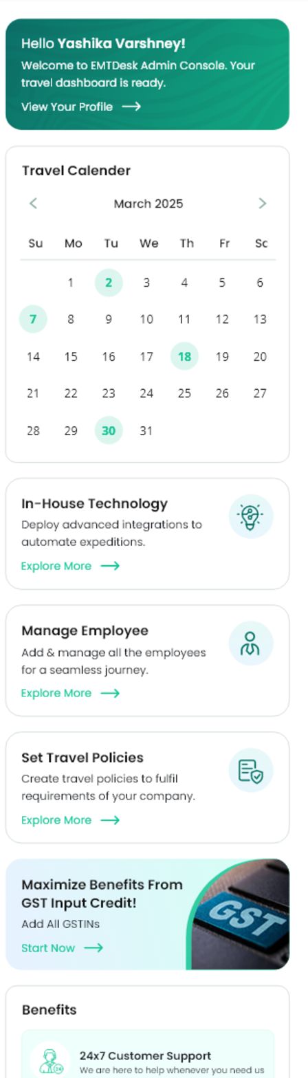
Same grid, same widget language, different scope and different navigation. The admin sees the whole organisation and gets the governance items — User/Employee, Company Settings, Travel Policy, Reports. The employee sees only their own travel, and My Approvals carries a live count instead.
| WHAT CHANGES | ADMIN | EMPLOYEE |
|---|---|---|
| Scope | Whole organisation | Own travel only |
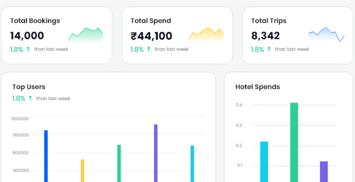
| Headline numbers | 14,000 bookings · ₹44,100 spend · 8,342 trips | 4,000 bookings · 1,342 trips · 3 approvals pending |
| Navigation | User/Employee, Company Settings, Travel Policy, Reports | My Approvals with a live count, My Trips, Visa |
| Job on the screen | Govern, audit and report | Book, track and get approved |
With / without Create Trip.
Create Trip is a module a company can switch on or off. That single flag changes the top of every dashboard, so I designed the header as two interchangeable strips rather than letting the page reflow: the trip-led entry point, or the direct product bar.
A full-width banner opens trip creation — the right start when a company books multi-service trips with approvals attached.
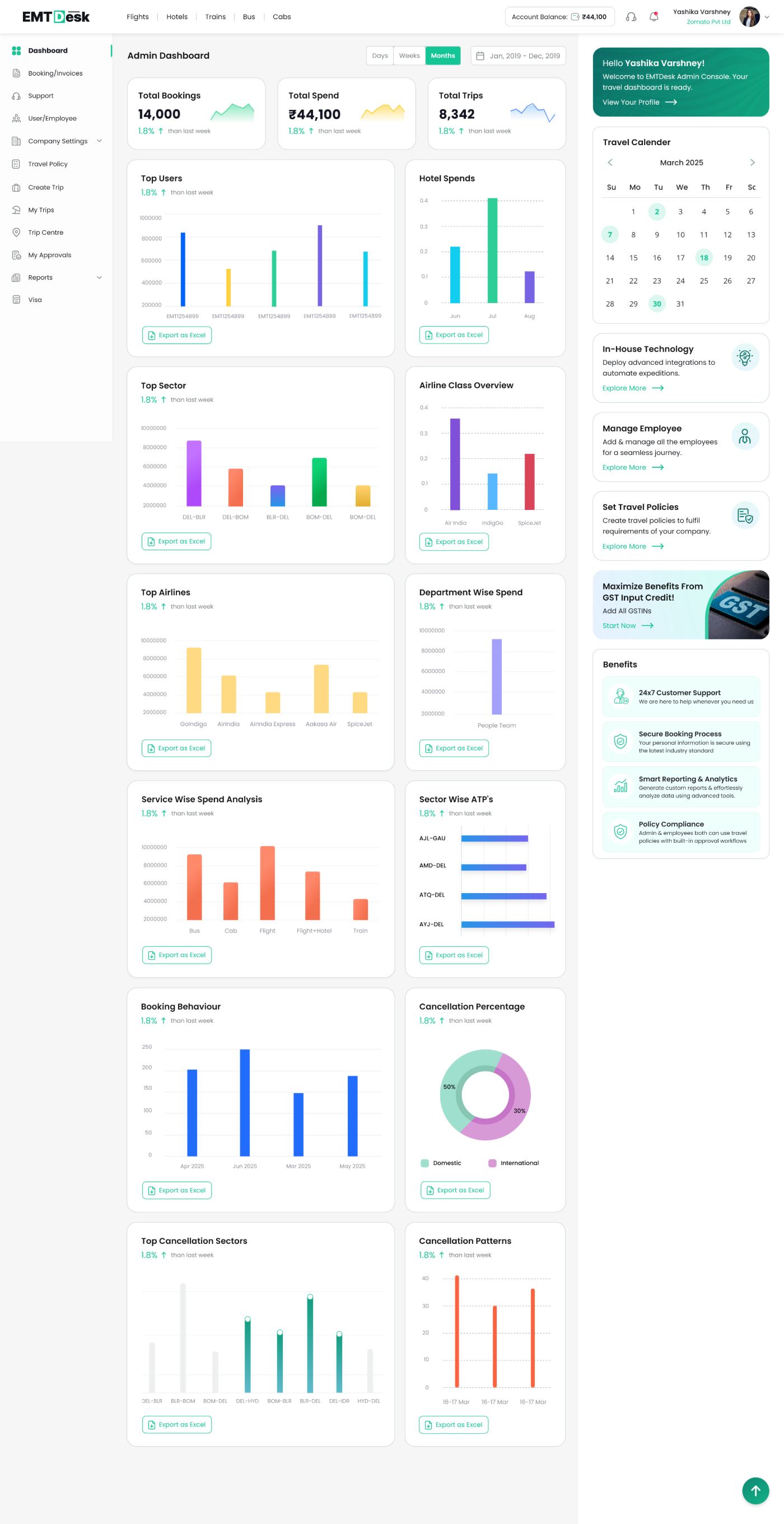
The banner is replaced by a product bar — Flights, Hotels, Trains, Bus, Cabs — for companies whose people book single services directly.
Anatomy of the grid.
Everything below the header is one repeating unit — title, delta, chart, export. Fourteen widgets, one contract, so a new report can ship without a new layout. The order runs from money to behaviour to exceptions.
Spend and volume first
Three KPIs, then who and where the money went. This is the layer a finance review starts from.
Total Bookings · Total Spend · Total Trips · Top Users · Hotel Spends · Department Wise Spend
How people actually travel
Sector, airline, class and service mix — the inputs to any negotiation or policy change.
Top Sector · Top Airlines · Airline Class Overview · Service Wise Spend · Sector Wise ATPs · Booking Behaviour
Where value leaks
Cancellations close the page, because they are the thing an admin can act on this week.
Cancellation Percentage · Top Cancellation Sectors · Cancellation Patterns
SME & EMTDesk Plus.
Enterprise clients arrive with volume; SMEs arrive with five people and no travel desk. For them the dashboard's problem is inverted — on day one there is nothing to report. So the same grid doubles as an activation surface: a milestone strip earns EmtCash, and completing it unlocks EMTDesk Plus — ₹449 worth of subscription benefits, free for 90 days.
Flat 50% off — ₹100 down to ₹50 per booking.
Flat ₹50 back on every flight booking.
Flat ₹100 back on every hotel booking.
Zero-amount booking, cancel free up to 24 hours.
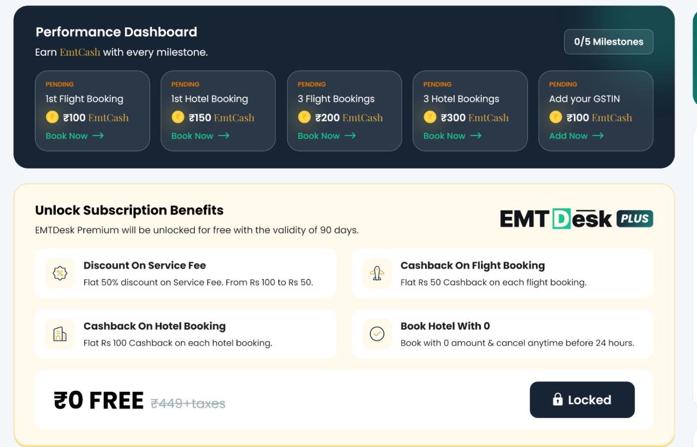
Two stacked strips carry the whole activation story: five pending milestones with their EmtCash value, then the ₹449 benefit set sitting behind a Locked button. Below them every widget shows a skeleton with “No data available” instead of collapsing.
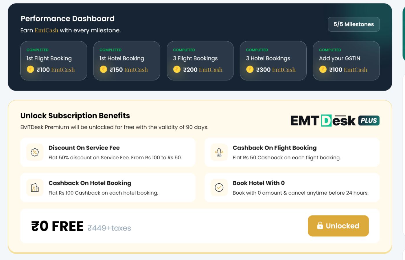
Same two components, flipped in place: PENDING becomes COMPLETED, Locked becomes Unlocked, and ₹449+taxes is struck through beside ₹0 FREE. Nothing moves position, so the change reads as progress rather than a new screen.

Once membership is live both promotional strips disappear and the only trace is the PLUS lockup on the logo. Paid state is quieter than free state — the reward for converting is a cleaner screen.
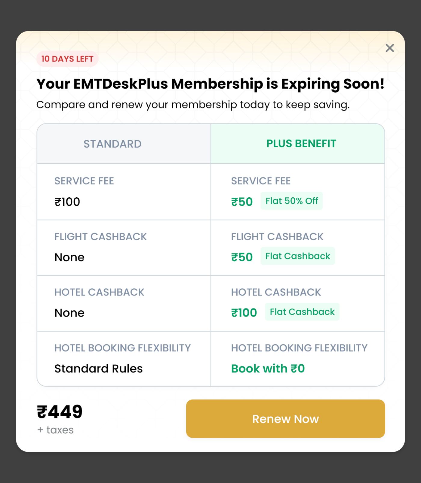
Renewal is argued, not asserted: Standard vs Plus in rupees, row by row, with price and CTA last. The countdown chip creates urgency inside the modal so the dashboard itself stays clean.
Corporate savings.
Spend reporting tells a travel desk what left the company. Savings is the harder half — it has to prove what EMTDesk kept in. It sits at the foot of the admin dashboard as a four-tab block, with Corporate Savings first, and it is the one module whose contents depend on how the client has set the platform up.
| CLIENT SETUP | LEVERS LIVE | SECOND PANEL SHOWS | QUESTION IT ANSWERS |
|---|---|---|---|
| With travel policy | Policy + SmartFare | Policy Highlights — Budget 89%, Advance 82%, Cabin 91% | Is our policy actually being followed? |
| Without travel policy | SmartFare only | Savings Breakdown — Flights ₹3.5L, Hotels ₹1.1L, Cabs ₹30k | Where is the platform saving us money on its own? |
| Hybrid model | Both, reported separately | Savings Source — Policy ₹4.8L vs Smart Fare ₹3L | Which lever is doing the work? |
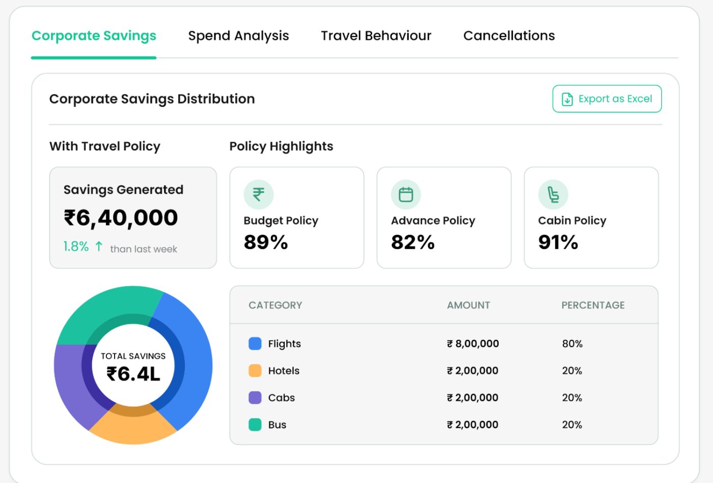
Compliance is the proof. Three policy types are reported as percentages, so a travel desk can see which rule is weak — advance purchase at 82% here — rather than only the total.
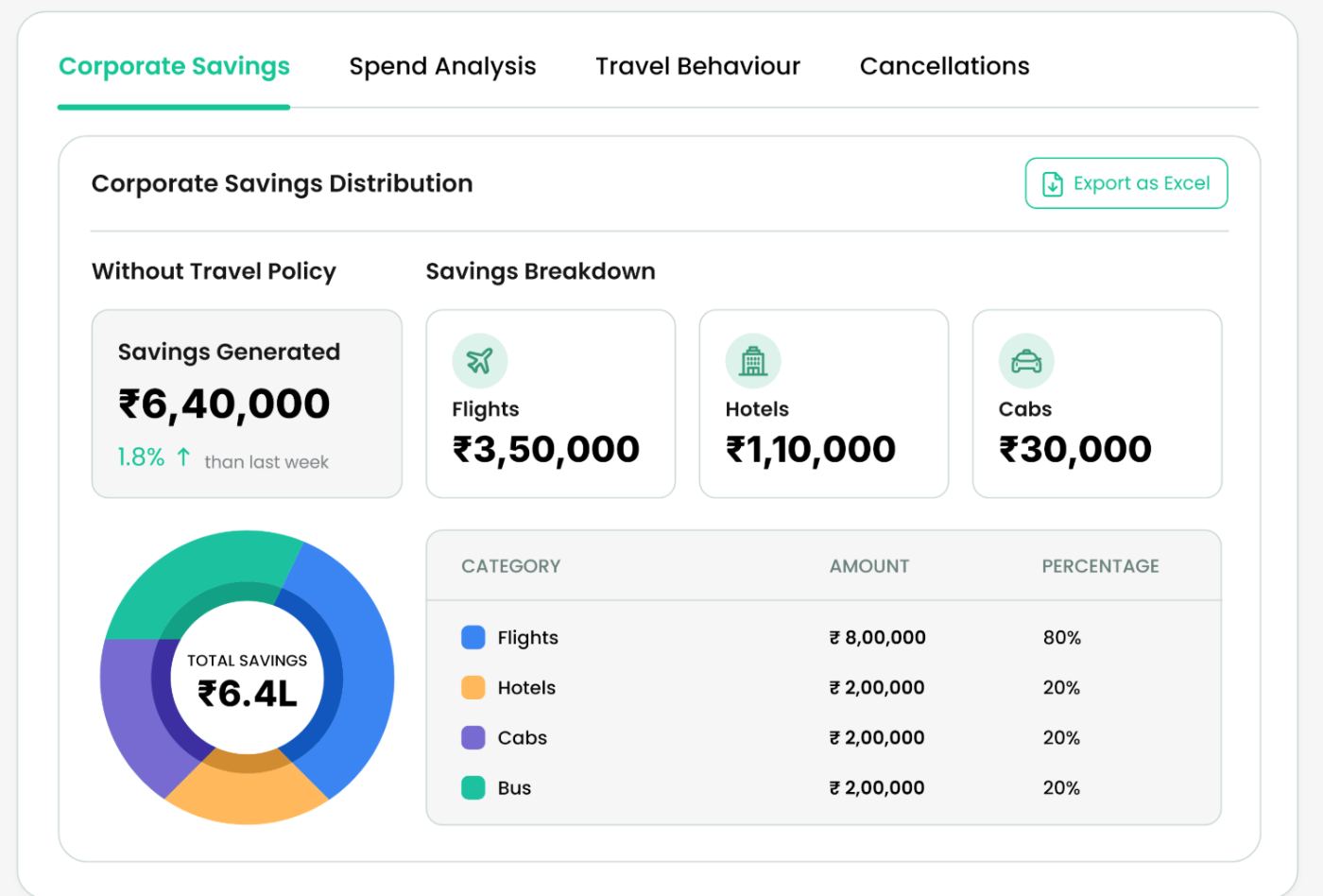
With no rules to measure against, the panel switches to where the fare engine earned it — flights, hotels, cabs in rupees. It also becomes the argument for setting a policy up.
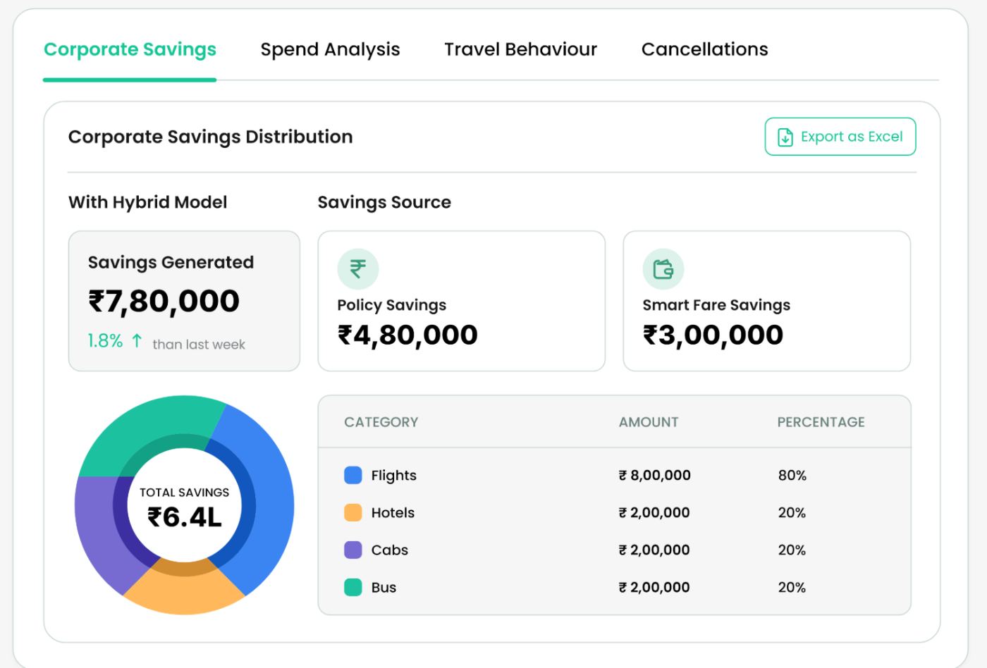
Both levers reported side by side — ₹4.8L from policy, ₹3L from SmartFare. Two numbers that add to the headline, which is what makes the total defensible in a finance review.
Savings closes the dashboard rather than opening it. Spend answers “what happened”; savings is the conclusion you reach after reading it.
Savings Generated tile, donut and category table never move — only the second panel changes, so the module stays recognisable across setups.
The donut carries the ₹6.4L total; the table repeats it as amount and percentage per category, for people who read tables and people who read shapes.
Flights, hotels, cabs and bus keep the same four hues everywhere in the module so the donut and the table can be read together.
Export as Excel stays on the module, because travel desks forward savings to finance rather than screenshot it.
A setup with no policy never shows a compliance number. The module only reports levers the client has actually switched on.
One form, three booking types.
Create Trip is where governance actually begins. Instead of booking a flight and attaching approval to it afterwards, the user opens a trip first: purpose, dates, billing entity, travellers. Everything booked later — flights, hotels, cabs, visa — hangs off that trip, which is what makes approvals, cost allocation and missed-savings reporting possible downstream.
An employee travelling on company work, billed to a business entity and run through policy and approvals.
A candidate, client or contractor the company is flying in — not an employee, but company-paid.
An employee using the corporate platform for their own travel, so they get the rates without charging the company.
Trip Details
Booking type, trip name, dates, purpose of travel and description, business entity, billing entity. Which fields appear and which are mandatory comes from Create Trip Configuration, so each client's own purpose list and cross-billing rules drive the form.
Traveller Details
Adult / child / infant counts, then one card per traveller with title, name, date of birth, phone and email. Counts drive cards, so a four-person trip is built by stepping a number rather than by repeating a form.
The baseline form. Purpose of travel and purpose description carry the justification an approver reads; business and billing entity decide which books the cost.
Traveller card has no Type of Travel — everyone on a business trip is an employee.
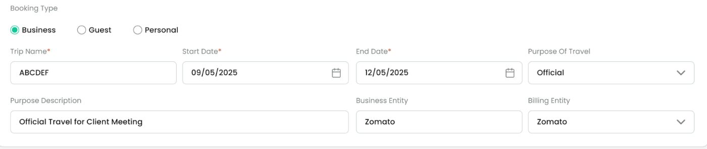
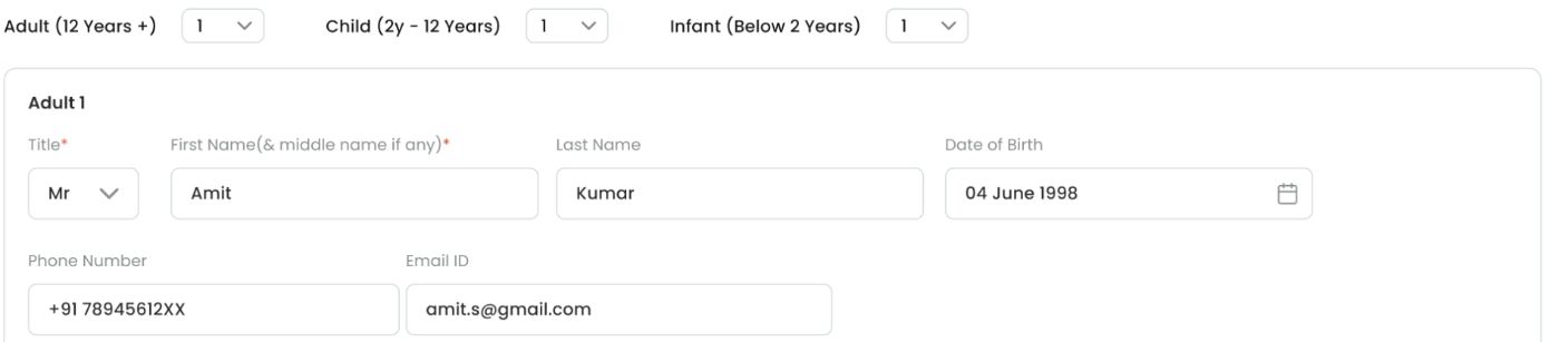
Trip Details gains a mandatory Requested By, because a guest cannot be their own accountable owner — an employee has to stand behind the spend.
Adds Requested By* · Type of Travel locked to Guest.
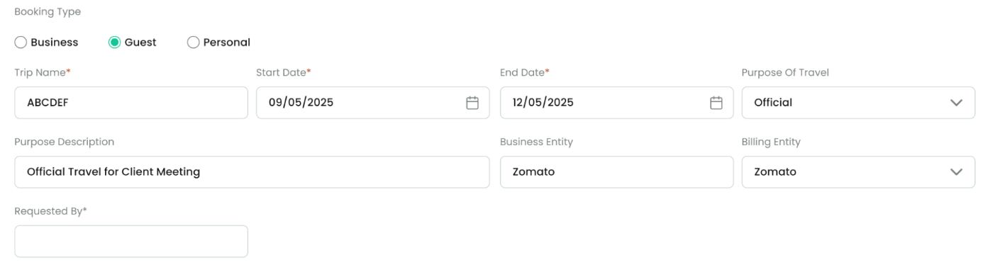
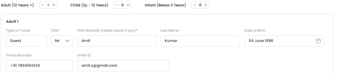
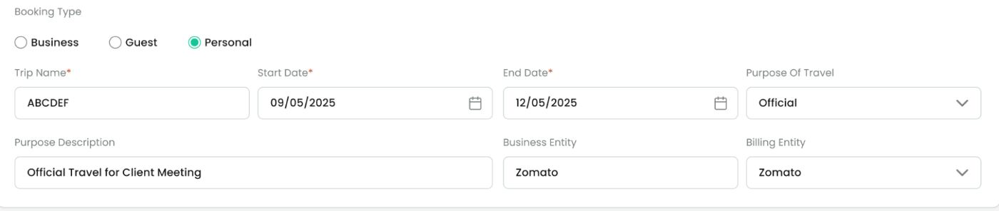
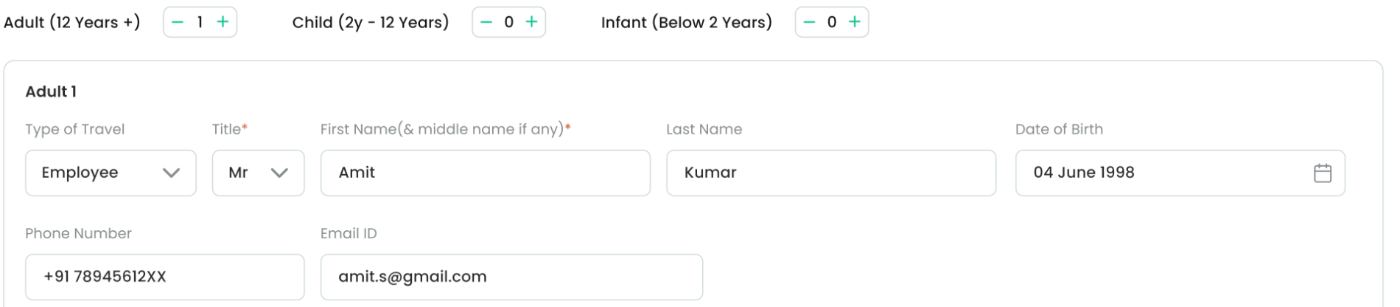
Structurally identical to business so employees do not learn a second form, with Type of Travel shown as Employee to make the distinction explicit on the record.
Same fields as Business · Type of Travel = Employee.
| BOOKING TYPE | EXTRA FIELD | TRAVELLER CARD | WHY |
|---|---|---|---|
| Business | — | Title, name, DOB, phone, email | Policy and approval apply; traveller identity is already known to the org |
| Guest | Requested By (mandatory) | Adds Type of Travel = Guest | Spend needs an internal owner even though the traveller is external |
| Personal | — | Adds Type of Travel = Employee | Keeps personal bookings separable from company spend in every report |
After submit — pending for approval
The trip is created and every service on it goes into one confirmation view: status first, then flight, hotel, traveller list, fare breakup and documents. Ticket and PNR columns stay blank until approval clears — the screen never implies a booking that has not happened.

One amber banner states “Booking Request is Submitted & Pending For Approval” above everything else, so nobody has to guess whether they are booked.
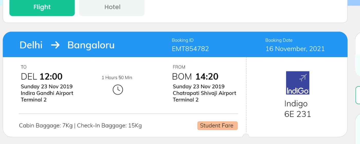
Flight and Hotel are tabs on one trip rather than separate confirmations — the same shape the trip was created in.
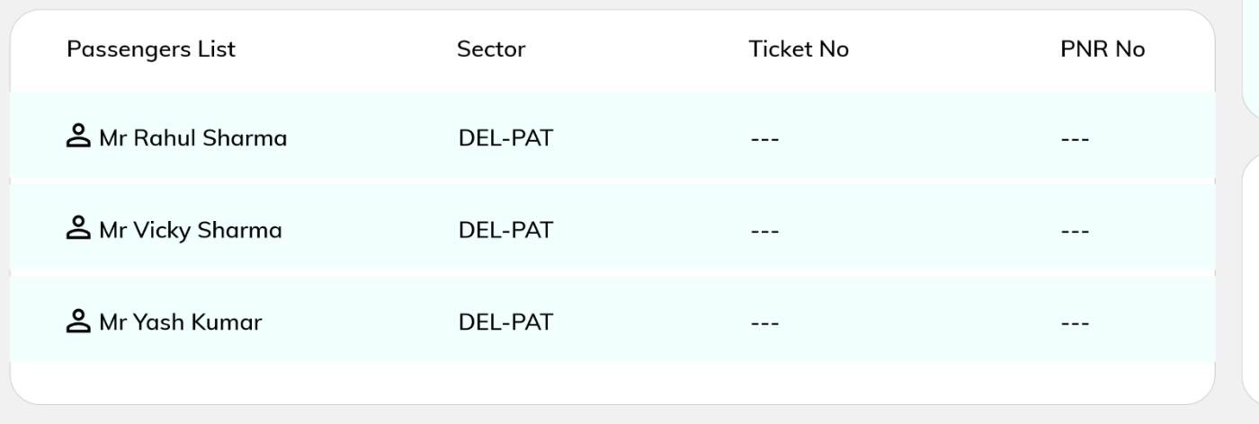
Ticket No and PNR hold “---” until approval clears. No placeholder that could be mistaken for a ticket.
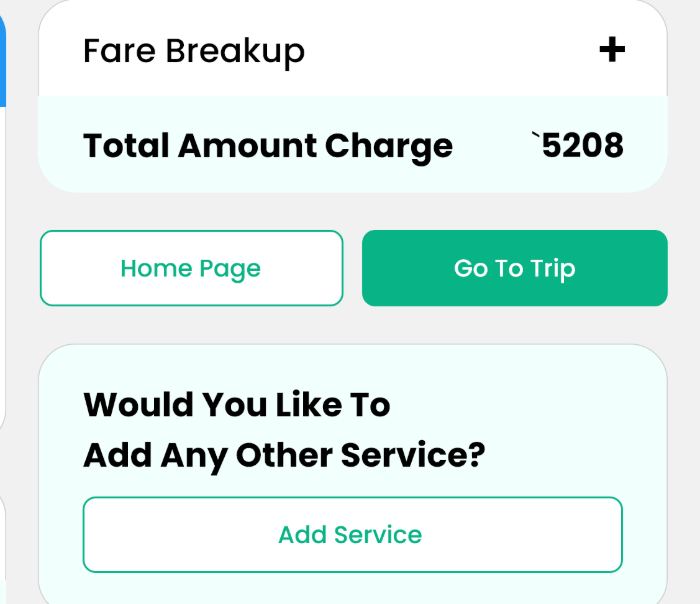
Fare breakup, Add Service and Go To Trip sit in the rail, so the trip keeps growing without returning to Create Trip.
Approvals & trip operations.
Once a trip is created it enters a queue. The approver has to clear it, the traveller has to watch it, and the travel desk has to own it. Rather than design three screens, I designed one row — trip ID, traveller, product icons, requested-on, travel date, status — and changed only the columns and the action each role needs.
| SCREEN | WHOSE VIEW | COLUMNS IT ADDS | DECISION IT ENABLES |
|---|---|---|---|
| My Approvals | Approver — manager or finance | Approval Status, travel-date and status filters, bulk download | Clear or reject requests without opening each trip |
| My Trips | Traveller — their own record | Business / Guest / Personal tabs, product and booking-date filters, Status | Know where my own trip stands |
| Trip Centre | Travel desk — everything in flight | Assignee, Assign To, Priority, Action | Own the queue: who is handling what, and first |
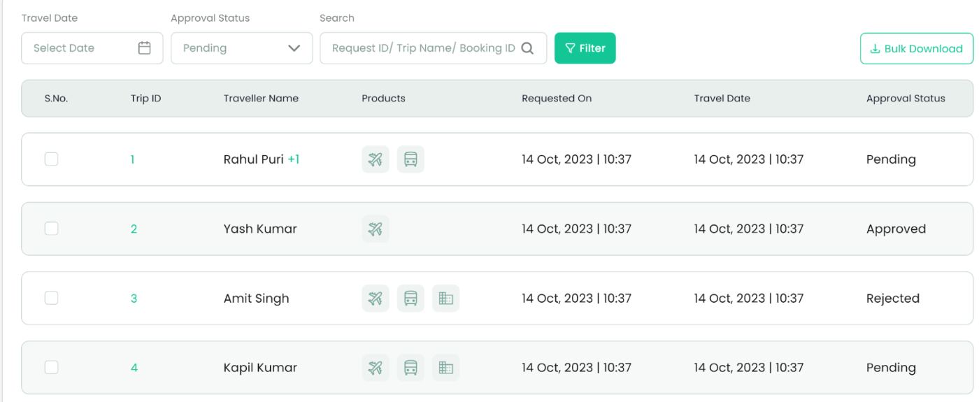
Filters come first — travel date, approval status, and a search that accepts request ID, trip name or booking ID, because approvers are usually chasing one specific request someone pinged them about.
Product icons instead of text: a row shows flight + bus + hotel at a glance.
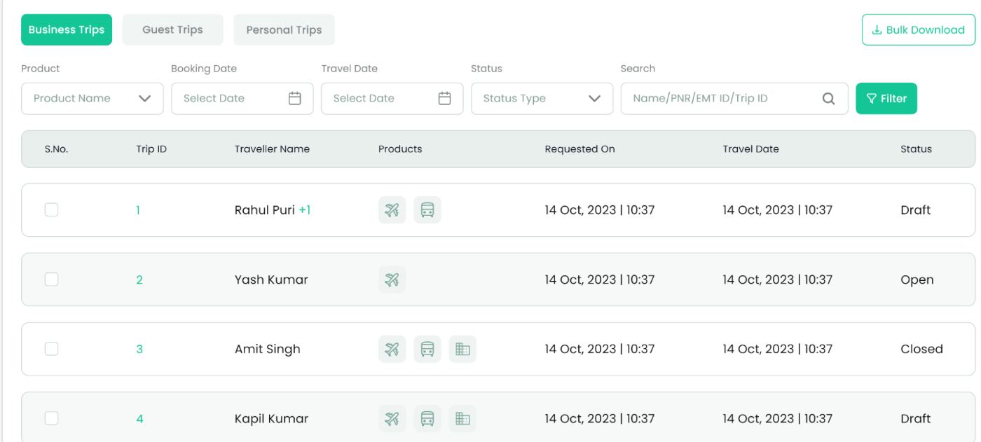
Booking type becomes tabs here rather than a filter, because Business, Guest and Personal are how a traveller thinks about their own history. Everything else matches the approvals table.
Status runs Draft → Open → Closed — trip lifecycle, not approval state.
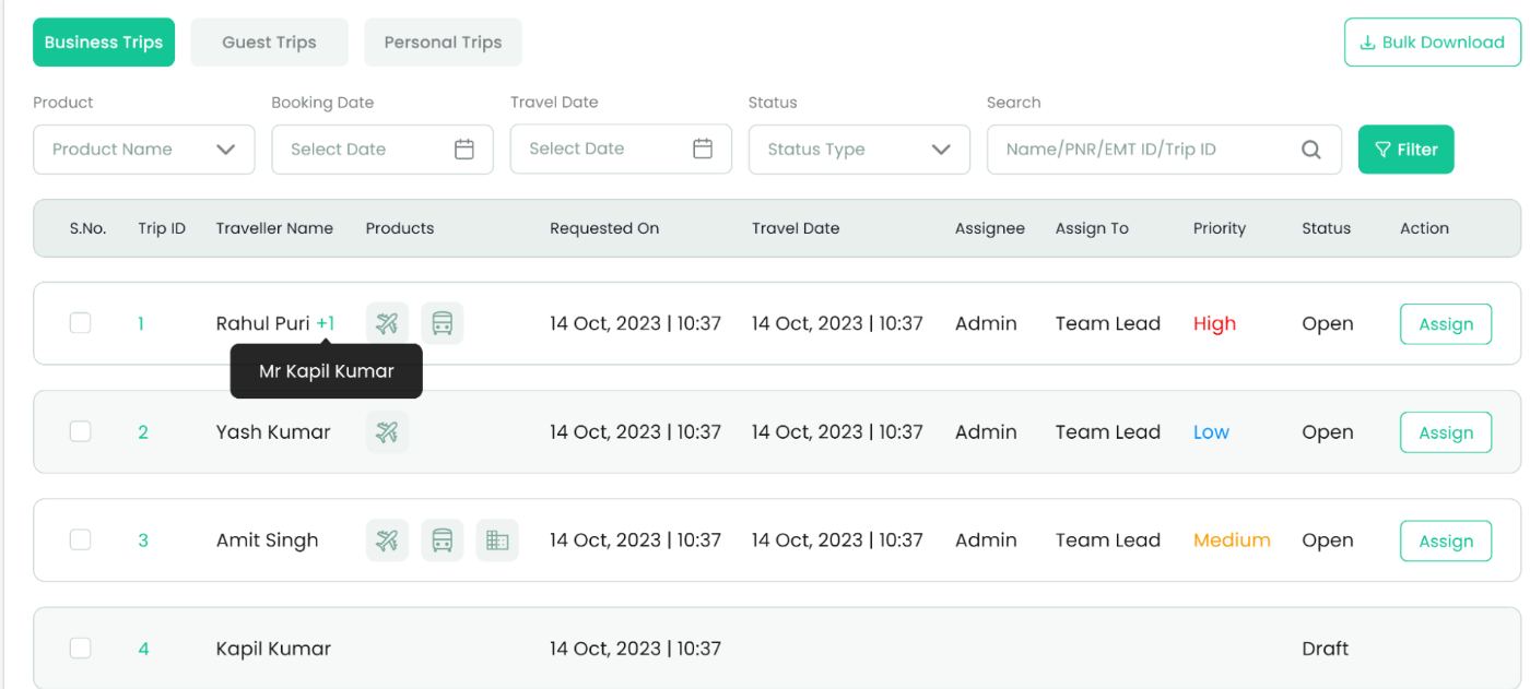
The operational view: the same rows plus ownership and urgency. Priority is the only place in the module where colour is used for ranking — High red, Medium amber, Low blue — and an Assign button ends each row.
Draft rows carry no assignee or action: nothing to work until submitted.
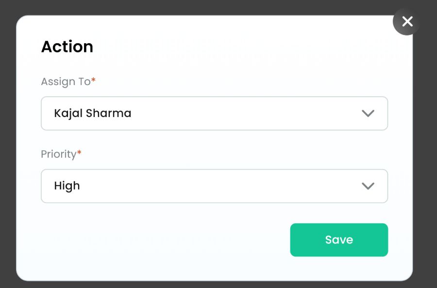
Assigning a request is the most repeated action on Trip Centre, so it is a modal with exactly two required fields — who owns it, how urgent it is — and one Save. No navigation away from the queue, no partial states to clean up.
Trip ID, traveller, products, requested-on, travel date. Learn it once on approvals and Trip Centre reads instantly.
“Rahul Puri +1” with a hover naming the second traveller — the row stays scannable without hiding who is flying.
Bulk download sits on every table, because travel desks reconcile in spreadsheets, not row by row.
Approvals filters by status; My Trips tabs by booking type. Tabs are for identity, filters are for state.
Colour appears only on Priority. Status stays neutral so urgency is the thing that catches the eye.
Out-of-policy flags, missed savings and approver history live on the trip detail, so this queue can stay a list.
Company attributes & configuration.
A conglomerate is not one company: a parent sits above several subsidiaries, each with its own departments, cost centres and rules. Company Attributes defines the data model per entity; Configuration switches modules on per entity. Every toggle changes a field somewhere a traveller will see.
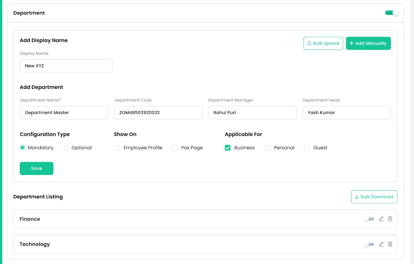
A switched-on attribute reveals three things in order: display name, the add form, and the existing listing. Configuration Type, Show On and Applicable For sit on one line because they are the three questions that decide whether a traveller ever sees this field.
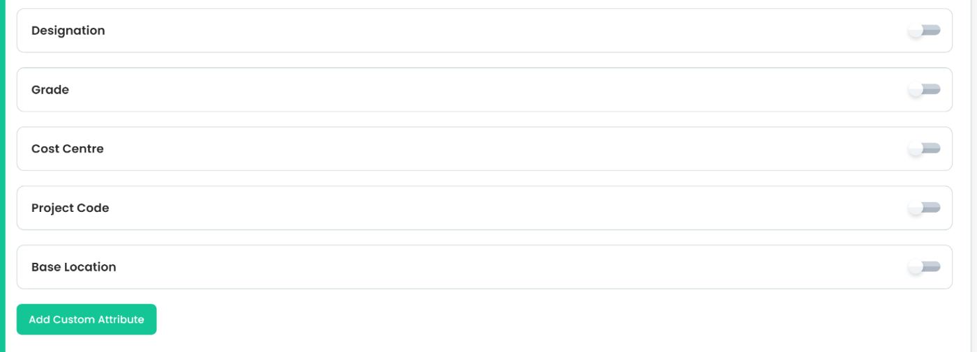
Collapsed rows show the whole data model on one screen — Designation, Grade, Cost Centre, Project Code, Base Location — so an admin decides what to use before filling anything in.
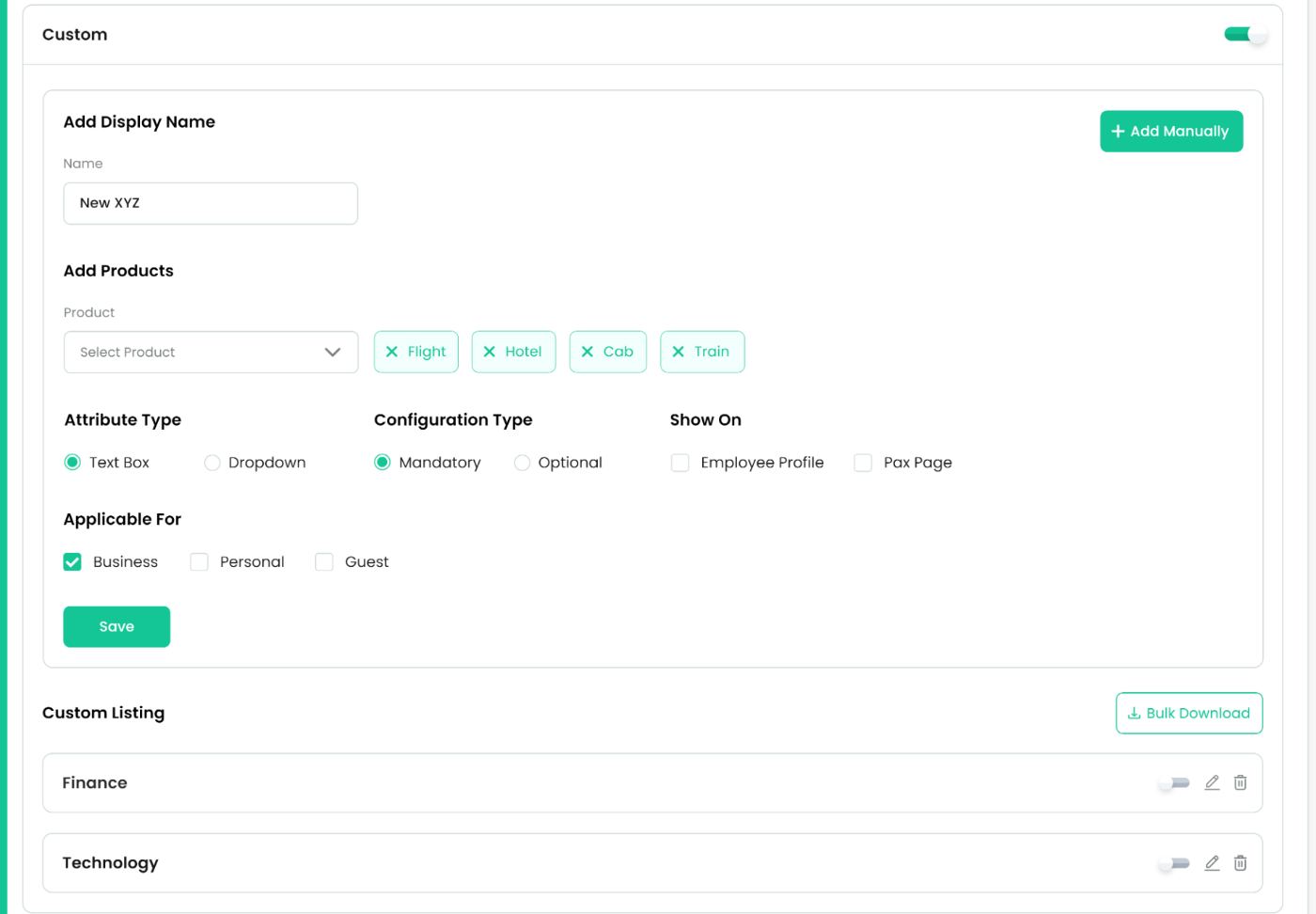
Custom attributes get everything the built-ins have plus two of their own: which products they apply to, as removable chips, and whether they render as a text box or a dropdown.
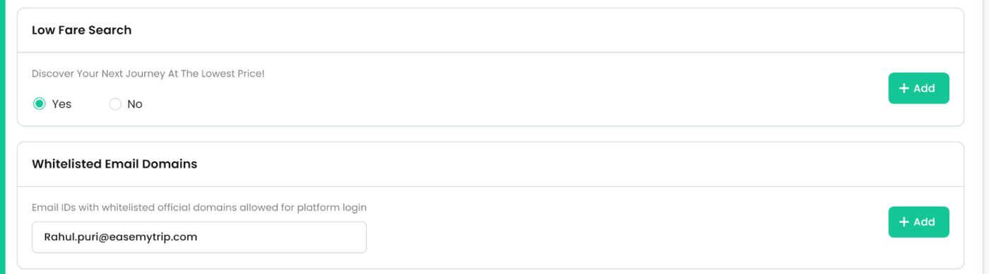
Two policies that are not attributes but belong to the entity: whether low-fare search is enforced, and which email domains may log in at all. Both are single decisions, so both are single rows.
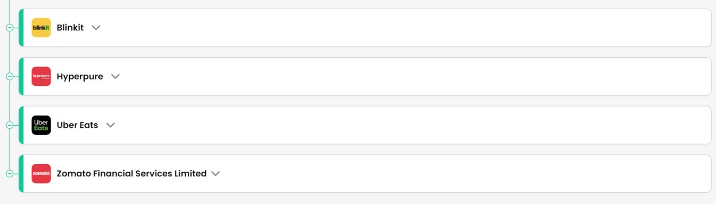
Child entities are collapsed rows connected by a spine, each carrying its own full attribute set. Configuration is per entity, not per account — which is what makes cross-billing meaningful later.
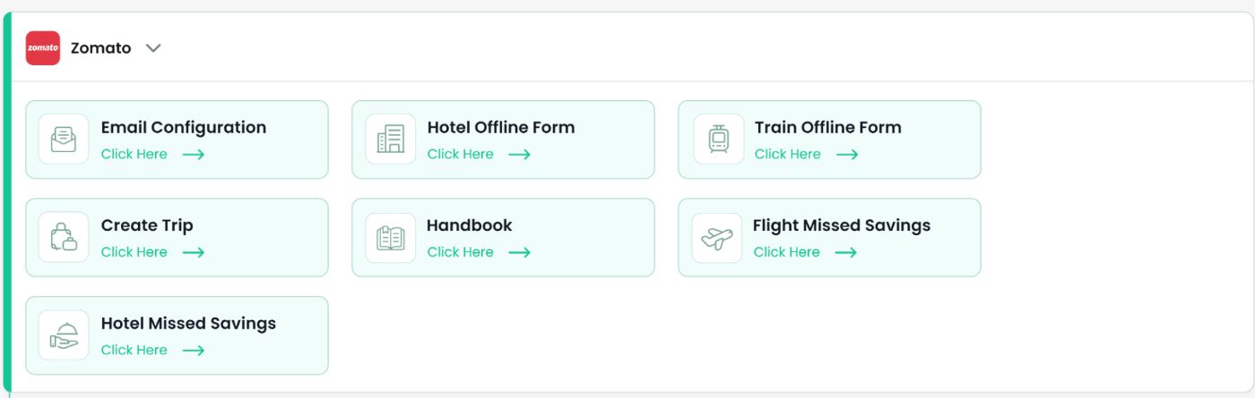
Seven module cards per entity, each a doorway rather than a setting: email configuration, offline forms for hotel and train, Create Trip, handbook, and missed savings for flight and hotel.
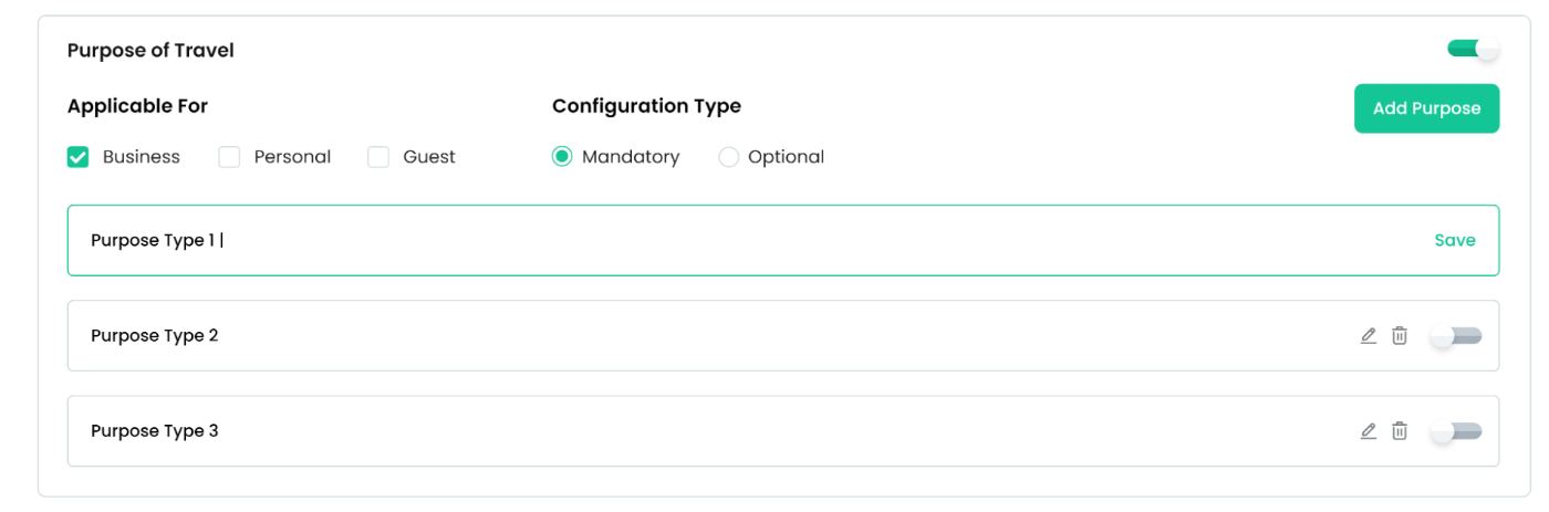
Behind one of those cards: the purpose-of-travel list a client maintains itself, with applicability per booking type and mandatory / optional per field.

Two remaining toggles decide whether justification text is compulsory, and whether one entity may bill another — the switch that makes Billing Entity a dropdown instead of a fixed value.
Set here → changes there
| SET HERE | CHANGES THERE |
|---|---|
| Purpose of Travel list | The Purpose Of Travel dropdown in Create Trip — client-owned vocabulary, not ours. |
| Configuration Type: mandatory | The red asterisk and the validation on that field for the booking types it applies to. |
| Applicable For: Business / Personal / Guest | Whether the field appears at all on each of the three Create Trip forms. |
| Show On: employee profile / pax page | Whether the attribute shows on the traveller record and on the passenger page at booking. |
| Enable Cross Billing Entity | Billing Entity becomes selectable, so one entity can carry another entity’s cost. |
| Whitelisted email domains | Who can sign in at all — the first gate before any of the above matters. |
People & profile.
Adding an employee means answering four separate questions, only one of which is “who are they”. The other three — which policy binds them, who approves their trips, and who may act on their behalf — are what turn an account into a governed traveller. The profile is the other half: the record the traveller maintains so a ticket can be issued without a phone call.
| TAB | QUESTION IT ANSWERS | WHAT BREAKS WITHOUT IT |
|---|---|---|
| Employee Details | Who is this person, and how are they tagged? | Bookings cannot be allocated to a department, cost centre or entity. |
| Policy | What are they allowed to book? | Every fare is in-policy by definition, so there is nothing to flag or save against. |
| Approvals | Who signs off, in what order, by when? | Requests reach the Trip Centre with no owner and no deadline. |
| Corporate Secretary | Who can act for them? | Executive assistants book from personal accounts and the trip leaves the system. |
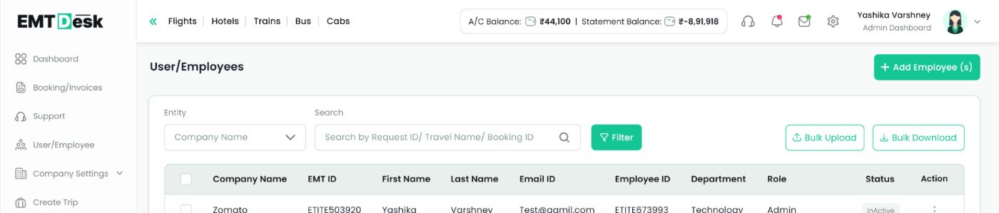
The same grammar as every other table in the product — entity filter, one search field, bulk upload and bulk download — plus a Status pill that is the only column an admin regularly changes.
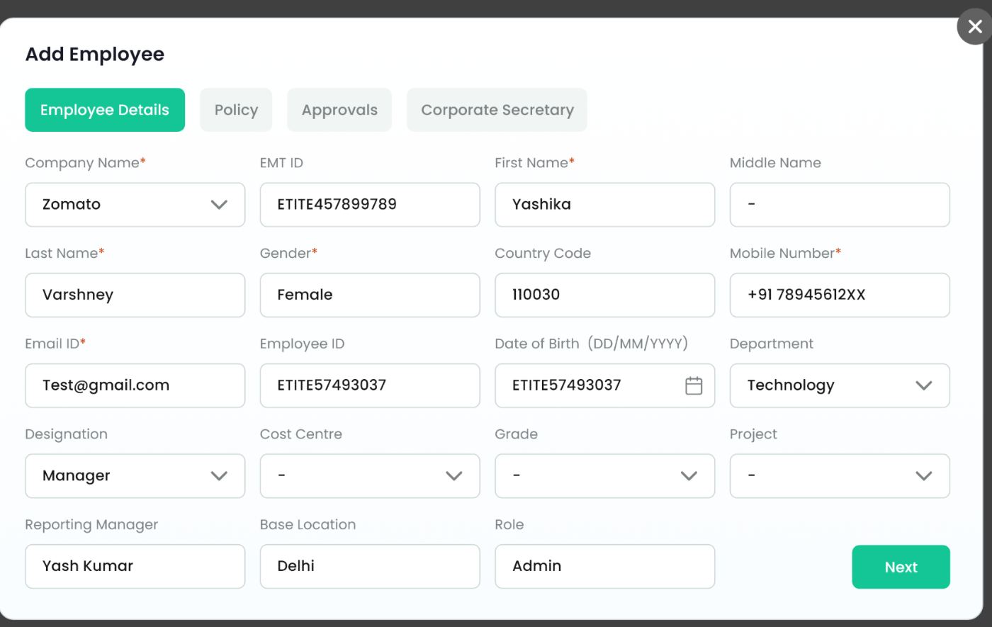
Only five asterisks. The rest — Cost Centre, Grade, Project, Base Location — are the configured attributes, appearing here as dropdowns rather than free text so the data stays reportable.
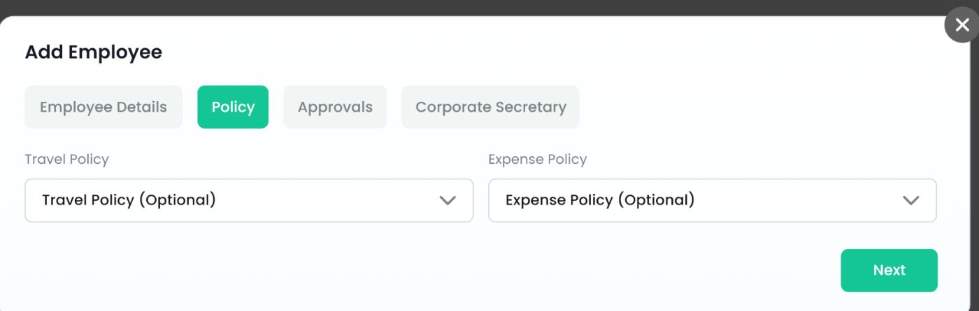
Travel Policy and Expense Policy are both optional, because a company can run EMTDesk with no policy at all and still get approvals.
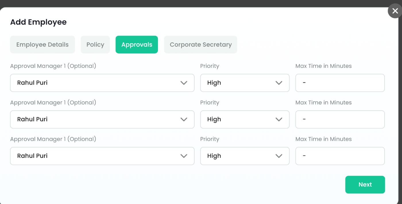
Each with a Priority and a Max Time in Minutes. Time is per approver, not per request, which is what lets a stalled trip escalate instead of sitting silent.
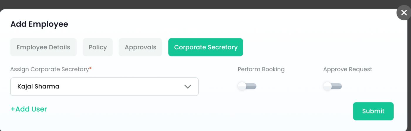
May this person book for the employee, and may they approve on their behalf. Assigning a secretary is mandatory here — the permissions are not.
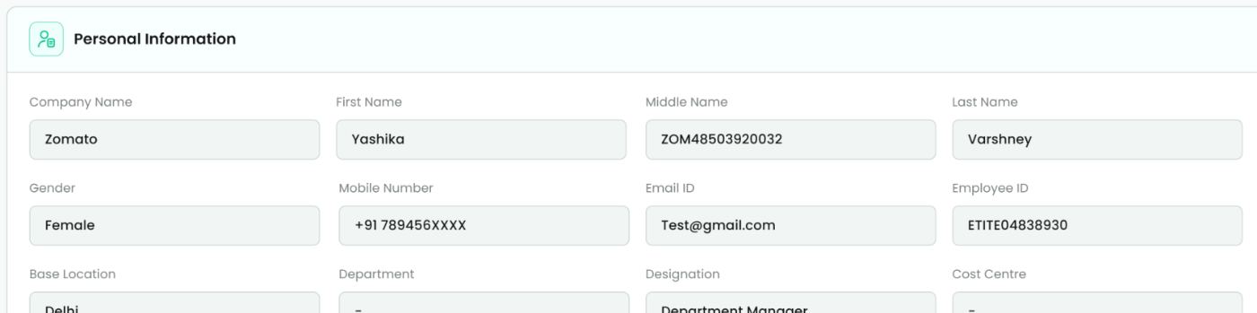
Sixteen fields in the same four-column rhythm as the admin form, but muted and read-only — the traveller can see how they are classified without reclassifying themselves.
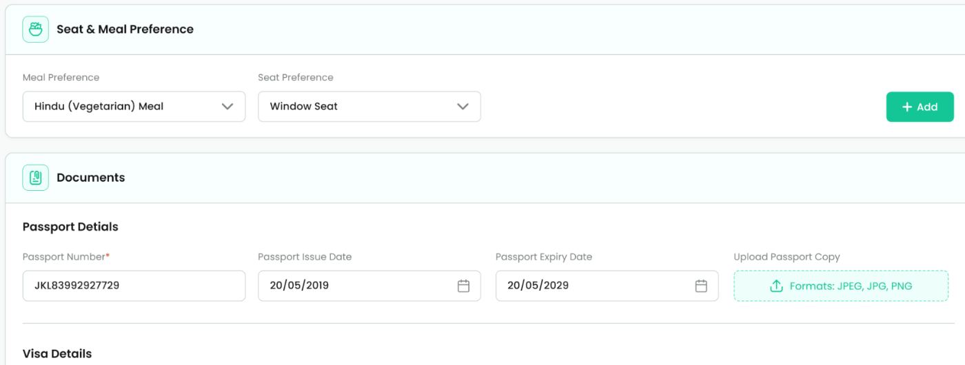
Seat and meal sit above documents deliberately: the light, frequently-changed choice first, then passport, visa, frequent flyer and vaccination — each with its own expiry date.
System & handoff.
Two brand colours, one typeface, one radius, one border. EMTDesk spans a marketing site, an SME activation flow, a booking engine, an approvals desk and a configuration console — the only way that stayed coherent was to make the system small enough that nobody needs to consult it.
CTAs, active states, key interactive elements
EmtCash, Plus, savings and rewards
Page backgrounds behind every card
Primary text and dark fills
Labels, placeholders, disabled state
Validation errors and destructive actions

EMTDesk, EMTDesk Plus in green and EMTDesk Plus in amber — the same wordmark carrying the tier. Poppins at three sizes only: 20 bold, 18 semibold, 16 regular.

Three steps only. A dense console does not need a display size, and capping it stopped hierarchy inflation.
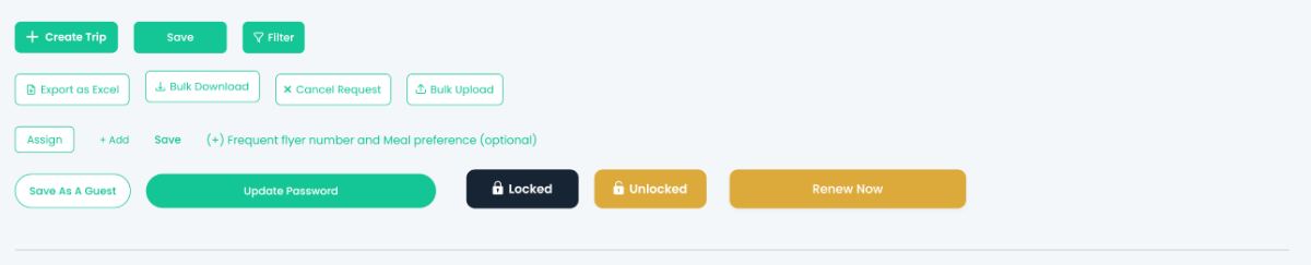
One radius across the whole product. Filled green for the single action, outlined for the alternative, amber only where the action concerns money.
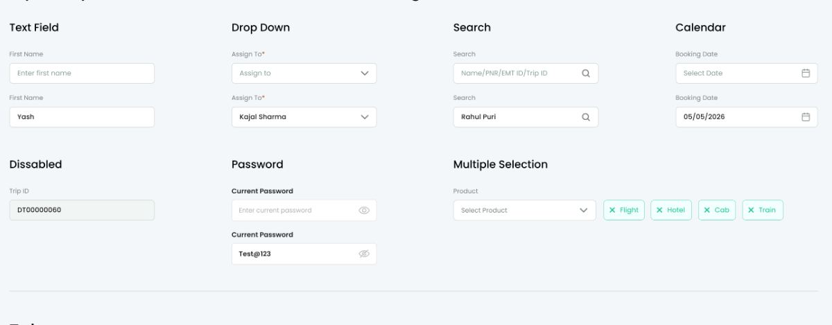
Text, dropdown, search, calendar, disabled, password and multi-select all share one frame — a single input spec removed most of the visual decisions downstream.
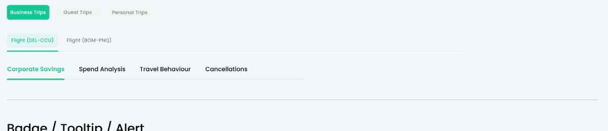
Three tab treatments with fixed jobs: filled pills switch modes inside a modal, underlined tabs switch content on a page, plain pills filter a list.
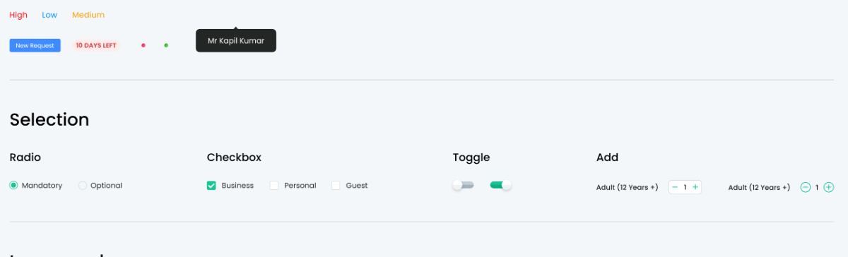
Status is always a pill, never coloured text — which lets Draft, Open, Closed, Active, Inactive and Pending read the same way in six different tables.
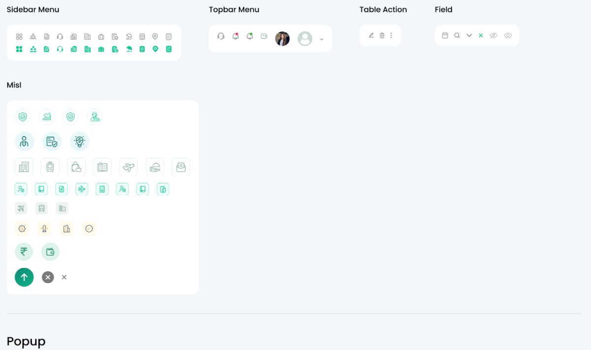
Sidebar, action and product icons at a single stroke weight, plus the airline and payment marks that have to be recognisable rather than consistent.
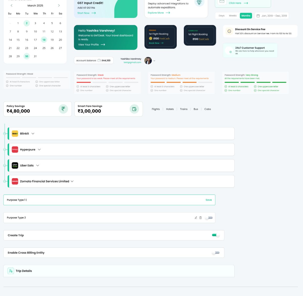
Calendar, savings tiles, password strength, entity tree, toggle rows, promo cards — a new screen is arranged from known parts instead of rebuilt from buttons and inputs.
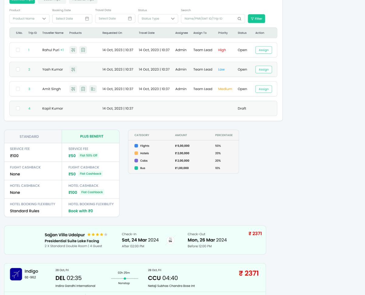
Filter bar, header row, status pill, kebab action, plus invoice and fare-breakup blocks. My Approvals, My Trips, Trip Centre and User/Employees are the same table with different columns.
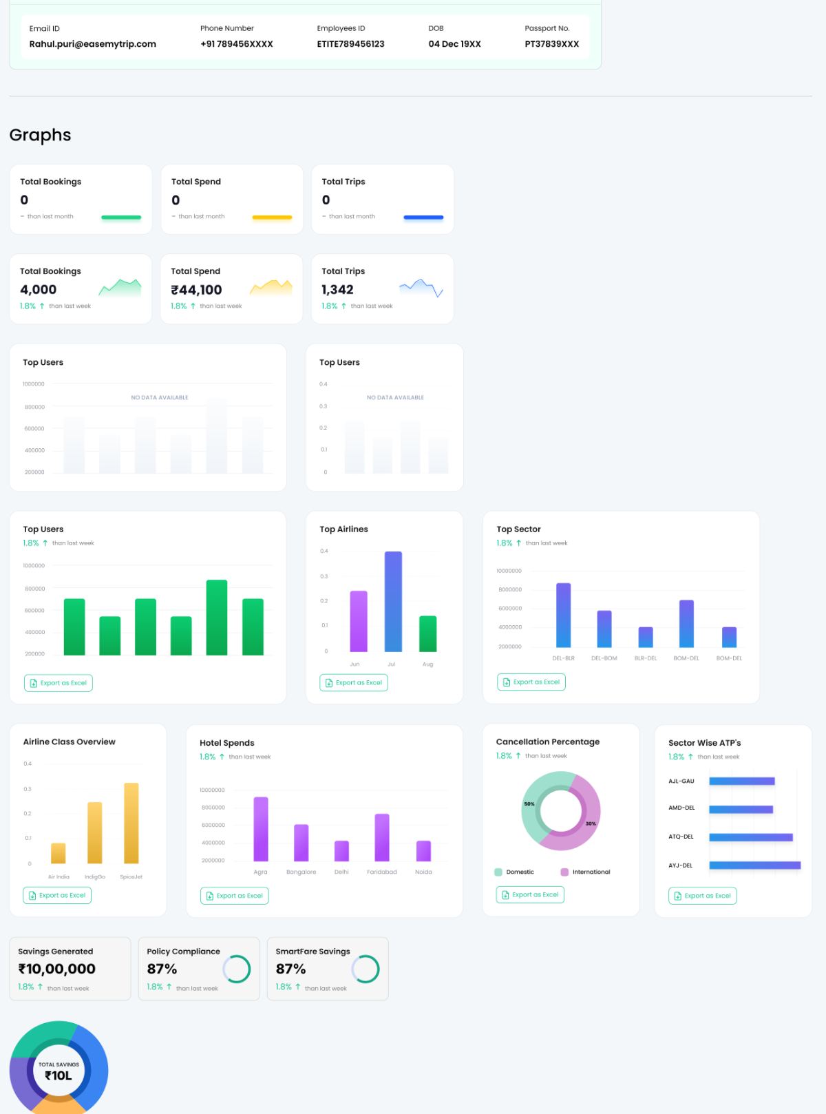
Metric tiles, bar, line, donut and progress rings — number formatting and currency treatment fixed in the component rather than decided per chart.
| RULE | VALUE | WHY IT HOLDS |
|---|---|---|
| Radius | 7px everywhere | Buttons, inputs, cards and pills share it, so nothing looks borrowed from another product. |
| Type scale | 20 / 18 / 16 px | Three steps only. A dense console does not need a display size. |
| Typeface | Poppins, 3 weights | Bold, semibold, regular. Weight carries hierarchy so size does not have to. |
| Green | #14C595 | Actions and confirmations only — never decoration, never a background wash. |
| Amber | #DCAA3B | Money the user earns: EmtCash, Plus, savings. |
| Status | Pill, not text | Consistent target size and consistent reading across every table. |
| Currency | ₹ + Indian grouping | ₹4,80,000 not ₹480,000. The audience is Indian finance teams. |
The full system on a single artboard — logo through graphs — so an engineer scrolls rather than searches.
Disabled, focus, error and empty are drawn, not described.
Assembled patterns beside atoms, so the handoff answers “what does a filter bar look like”.
Every dashboard tile has a fixed anatomy — label, value, delta, icon — so new metrics need no new design.
Forms were specced as field lists driven by configuration, so engineering built one Create Trip, not three.
Every mock carries plausible Indian names, fares and PNRs — no lorem — so density problems surfaced in design.
Thanks for reading.
← back to all work