One dashboard for a company that read its numbers in a different place every time.
EMT Analytics is the internal product-analytics platform for EaseMyTrip — behaviour, revenue, retention and satisfaction for every product line, in one interface that product, marketing and leadership all read the same way.
- ROLE
- Lead UI/UX Designer
- DURATION
- 6 weeks
- PLATFORM
- Web dashboard
- SCOPE
- 9 analytics modules
- AUDIENCES
- 6 internal teams
Everyone had data. Nobody had the same answer.
Product managers pulled adoption from one tool, marketing pulled acquisition from another, finance kept revenue in spreadsheets. A single Monday review could produce three different active-user figures, and most of the meeting went into reconciling them instead of deciding anything.
The brief was not "build charts". It was to give six very different audiences one place they trust, without forcing any of them to learn an analyst's tool. That meant the hard design work sat in structure and defaults — what appears first, what stays hidden, and what every page can be relied on to do.
Five failures, and what each one had to become.
- 01Data scattered across separate analytics platforms→ One canonical source, one metric definition
- 02No way to compare metrics across product lines→ Product switcher on every view, comparison built in
- 03Reports assembled by hand, days behind reality→ Live views plus one-click CSV export
- 04User journeys invisible — drop-off was guesswork→ Funnel, flow and cohort views on real events
- 05Leadership had no glanceable health check→ Snapshot: whole business in under ten seconds
I shadowed a Monday review and wrote down every question asked out loud.
Across sessions with product, marketing, business and leadership, thirty-odd questions collapsed into four — always asked in the same order. That sequence became the spine of the product: every module answers one of them, and the page layout follows the order.
It also told me what to cut. Anything that answered none of the four went to a secondary report rather than the dashboard.
Nine modules, grouped by how often you look at them.
Navigation is ordered by frequency of use, not by data source — daily checks at the top, deep dives below, audience work last. Every module inherits the same global filters, so switching context never resets your query.
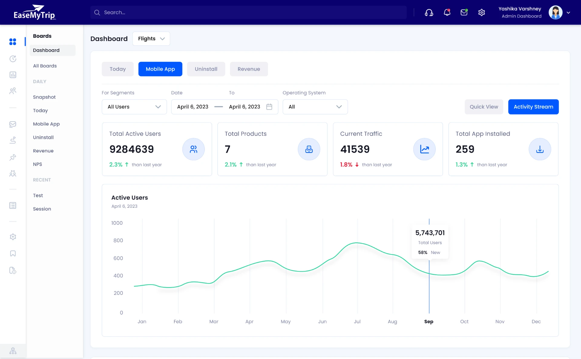
- DashboardActive users, traffic, installs, trend
- SnapshotDAU, WAU, MAU, activations — built for leadership
- TodayReal time, new vs returning, usage source
- Mobile appDAU, activations, uninstalls split by OS
- RevenueTotal, paying users, ARPU, device comparison
- UninstallActivation vs uninstall, net user loss
- NPSPromoters, passives, detractors, trend
- SegmentationAudience builder, find people, RFM groups
Walk the real screens.
Views from the shipped product. Each one repeats the same rhythm: filters, then KPIs, then the primary chart, then detail — so the second module you open already feels learned.
Segment, date range, operating system and product sit in one bar, in one order, on every module. Below them, four to six KPI cards carry the headline numbers with their period-over-period delta.
Decision: filters are global rather than per-chart. Reading a number always means knowing exactly which slice you are looking at.
Four rules the whole system obeys.
Summary first, breakdown on demand. No page opens with more than six numbers competing for attention.
Filters → KPIs → primary chart → detail. Learn one module, you have learned all nine.
Date, segment, OS and product persist across modules, so a diagnosis never has to be re-typed.
Light workspace, one accent, colour reserved for meaning — positive, negative, selected. Nothing else is coloured.
What changed after it shipped.
Reviews now start from one screen. Metric definitions are agreed once, in the platform, not per team.
Recurring decks that were rebuilt by hand each week became a saved view and an export.
Funnel and flow views let teams point at the exact step losing users, rather than debating causes.
New modules ship on existing components, so the ninth page cost a fraction of the first.
A good dashboard is not the one that shows the most. It is the one that answers the question you actually walked in with — and then gets out of the way.
The measurable win came from structure, not visuals: a fixed page skeleton, a shared filter model, and the discipline to keep things off the first screen.